Delicate strokes
Modern e-reader devices come with several fonts pre-installed, some of them exclusives, e.g. Bookerly or Ember on Amazon kindle devices, Nickel and Kakugo on Kobo, while some are available in the public domain1, such as the Tolino pre-installed fonts Vollkorn or Bitter.
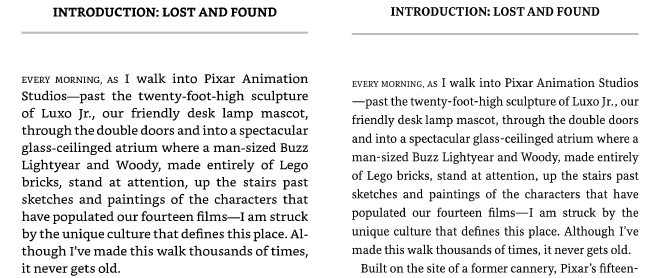
Some of those fonts have been designed specifically for the purpose of digital publishing and to provide a good reading experience on an e-reader or electronic device at many different, and in particular small, font sizes. However, technology of e-reader screens has constantly improved over time. Many current e-readers are based on the E Ink Carta HD display, which provides a high resolution of 300 ppi. This may be the reason why, for my personal taste, some of the designed for digital fonts appear a bit too sturdy and bold2, and consequently bland and boring. On a high resolution display, I have found that a more delicate book font with a bit more character is perfectly viable for a good reading experience and might resemble the appearance of a print book more closely.
On most current e-reading devices, you can sideload custom fonts. On the kindle, for example, it is as easy as dropping the font files in the fonts directory.
<Kindle>
└── fonts
    ├── <fontname>-regular.<ttf|otf|ttc>
    ├── <fontname>-bold.<ttf|otf|ttc>
    ├── <fontname>-italic.<ttf|otf|ttc>
    └── <fontname>-bolditalic.<ttf|otf|ttc>
Usually, e-readers support the font file formats .otf (OpenType Font) and .ttf (TrueType Font). On my kindle, even .ttc (TrueType Collection, a single file containing multiple fonts, e.g. different typefaces or a font family) have found to be working just fine.
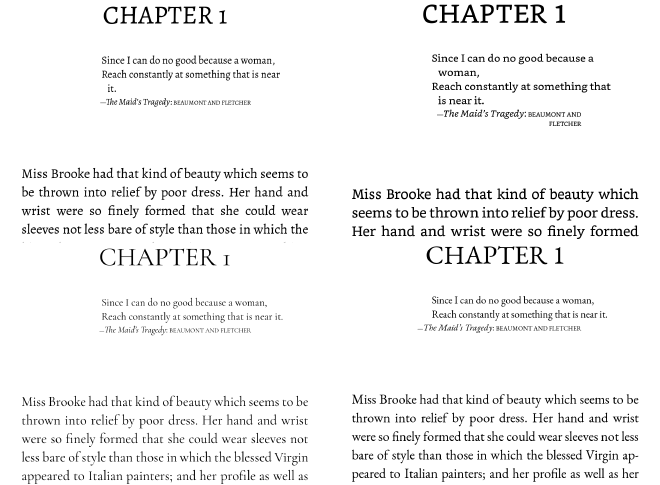
The screenshot3 compares the Amazon exclusive and Kindle default Bookerly (top right) with the publicly available Alegreya(top left, from Huerta Tipográfica, the font foundry which also desgined the Bitter font on Tolino devices), EB Garamond(bottom right) and Cormorant Garamond.

While Cormorant Garamond appears a bit thin and too frail to read comfortably, I prefer the more delicate appearance of both Alegreya and EB Garamond to the standard Bookerly. The following screenshot shows the difference in weight and contrast for a capital C at maximum font size.

You will notice that Bookerly and EB Garamond have the largest weight, while Cormorant Garamont has the lowest. Alegreya has a similar, relatively low, stroke contrast as Bookerly, while being slightly thinner overall. Cormorant Garamond tapers out the most at the top and bottom of the arc, resulting in a high stroke contrast. EB Garamond shows a similar contrast at an overall larger weight. The overall larger weight of EB Garamond seems to make the difference for readability on an E Ink screen also on smaller font size. Where Cormorant becomes too frail, EB provides a good readability while maintaining the interesting character of more delicate features.
A well-known extensive source for free fonts is the Google Fonts directory. Additionally, there is an abundance of resources to get recommendations and inspirations for new fonts, e.g. font lists Serif: Modern and Book text: recommended alternatives, Fonts in Use - Album Art) and discussions (quora.com, What are your favorite unknown body text fonts? or reddit.com, My preferred list of fonts). Please note that some fonts discussed might be subject to a commercial license and additional cost.

After one of my inspirational trips over font resources, I purchased Kiperman from font foundry Harbor Type and enjoy it since when reading non-fiction books.
Disclaimer: I am not affiliated with any of the e-reader manufacturers or font foundries mentioned in this article. This post and all featured fonts result from personal interest only and no commissions have been or are paid for mentioning or linking to a site, product or font.
-
Usually under the SIL Open Font License (OFL). ↩︎
-
Two type characteristics which seem to play a particular role here are the stroke contrast, i.e. basically the difference between the thickest and thinnest parts of a letter, and the stroke weight, i.e. the general or average thickness of a letter stroke. ↩︎
-
You can take screenshots on kindle by tapping both the top left and bottom right corners at the same time. The screenshot will be saved in a↩︎
.pngfile in the root directory of the device.